


If you ever find yourself needing a more modern, futuristic appeal to your brochures, this is the perfect tutorial for you. This tutorial will help you design your own, techy looking brochure with included resource links so that you can see where you can find some free stuff to use on your own designs. Let’s get started.
Final Image

Step 1
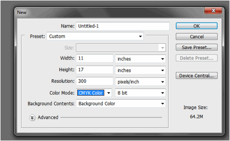
Create your brochure document first by opening Adobe Photoshop and going to File -> New – The new document window should open. In this window, you will set the dimensions and settings of your brochure document. For this tutorial. We have set the width and height dimensions to be that of an 8.5 x 14 brochure. This will allow beginners to use the template using their own printers. Also we set the resolution to 300ppi for the best quality prints.

Step 2
Great! The next step is to add the guidelines. First we shall divide the document via these guidelines. To do this, go to View -> New Guide In the window that opens, set a new vertical guideline to be placed at 4.625 inches from the left edge like so.

Step 3
Then, add the next vertical guide. This time position it at 9.375 inches from the left edge. This will then divide our brochure into 3 parts.

Step 4
Finally, through the same process, we also add 2 more vertical guidelines and 2 more horizontal guidelines for the margins of the designs. The measurement settings are listed below. In the end, it should look like the image below as well.
- Top Margin (Horizontal): 0.25 inches
- Bottom Margin (Horizontal): 8.25 inches
- Left Margin (Vertical): 0.25 inches
- Right Margin (Vertical): 13.75 inches

Step 5
The background is the next thing we need to setup. Keep in mind that this is just the FRONT part of our brochure and there are three panels to create. Remember that in a typical trifold brochure, the left most panel is the inner flap, the middle panel is the back cover and the right most panel is the front cover. Knowing this, we shall add a deep background color for the back and front covers. We first create a new layer to do this. Press CTRL+SHIFT+N to create this new layer. Name this ‘cover background’. Then, select the middle and right panels using the Rectangular marquee tool.

Step 6
Click on the ‘Gradient Color’ tool in the tools panel. If you do not see it, click and hold the Paintbucket tool to see it from a drop down menu. Once you have it activated, click on the gradient color box on the top in the options bar to start selecting your colors. The gradient color window should open. Just sent the colors that you want by clicking on the items marked on the image below. Once you are done, click and drag the gradient color tool into our selected area.

Step 7
Take note, that we used the radial color gradient style for our cover colors. You can adjust to different color gradient style background in the options bar as marked below. You will see these options always when you have the gradient color tool selected.

Step 8
Then, using the same process, we create another layer for the background of the left most panel. We also select that area with the rectangular marquee tool and color it with a lighter gradient color combination. This time it s a cream color with white as the partner.

Step 9
Now, we shall start with some basic techie style text. We download some nice futuristic brushes from this site here: (). From that site, we downloaded and installed the Orena and Terminator font under the Sci-Fi category. Then we type in our headlines and sub-headlines first. For this front cover design. We have changed the colors of course to contrast appropriately with the text

Step 10
Now we start adding some ‘techie elements’. The easiest way to do this is to use free resources like techie images, shapes and brushes that can be used in Photoshop to apply to your site. For our example, we got this nice set of techie type brushes that you can use. (http://browse.deviantart.com/?order=9&q=photoshop+brushes&offset=24#/dwsrlm). This is provided by a generous person from deviant art. Download it. Then, once downloaded, click on the “Brush tool”. Once selected right click on the canvass to bring up the brush content menu. Click on the Right Arrow icon and on the submenu that opens select ‘load brushes’. Find the brushes file to install them as new brushes in your Adobe Photoshop Installations.

Step 11
Now, create a new layer by pressing CTRL+SHIFT+N. Name this any name you like, just make sure you mark it as one of your techie effects. Change the foreground color to the color you want for your techie brush. Then , right click on the canvass to look again at the brushes context menu. This time, use the newly installed brushes. Take note of the size of the brush and adapt accordingly. Then just brush in the techie element that you want for an accent in our design.

Step 12
Repeat and mix and match the different shapes until you have the mix that you want. It is best to create a new layer for each effect first so that you can easily move and manipulate them. Also, take note that you need to change the color of these brushes depending on the lightness or darkness of our background. Also, if some of your brush shaper overlap, you might want to reduce the other shapes to around 20-50% depending on the intensity of the shape.

Step 13
In the end, we should have something like the image below. Make sure to save this if you have not already. Also, if possible, organize your different layers into folders so that it is easy to determine the different set of images that you created (for the different panels). You can find the create layer group/folder icon at the bottom part of the layers panel. Once you create the groups, just click and drag the layers to organize them.

Step 14
Next, we type in the body test for our brochure. Take note that for the font style, it is best here to use a simpler style font. Do not use a very intricate or wild style font because it will be harder to read. Any simple sans serif family font should be great for the body text for this kind of brochure. Here we used a variation of Helvetica.

Step 15
Now, to add some images, first create a new layer by pressing CTRL+SHIFT+N. Name this layer any name you like that describes the image banner. Use the rectangular marquee tool to inscribe a square that spans the top of both our front cover and back cover layer. Fill this with black as a placeholder for now.

Step 16
On top of this layer, paste in the images that you want for your brochure. Resize them as necessary by pressing CTRL+T. However, note that you actually do not have to fit them precisely on the rectangle we just created. Just place the images in such a way that the main features are at the box area.

Step 17
Then, select all the image layers by holding down the CTRL key and then click on each of their layers. Afterwards, right click on them to bring up the context menu. In the menu, select the option to “create clipping mask”.

Step 18
You should then see the images get “clipped” in the shape of the rectangle below. Once you are satisfied with this, select both images again along with our original rectangle layer. Right click on them and then select the option to ‘merge layers’.

Step 19
Then, go to Image -> Adjustments -> Photo Filter. Make sure of course you have the image layer selected. Choose ‘Color’ for the filter. Click on the box to select your theme color. Then, increase the density of the filter to around 90%.

Step 20
That should help make our image look more integrated into the theme. Repeat the process for all the images in your design.

Step 21
Great! With that we have finished the FRONT part of our brochure design. It should look something like this.

Step 22
Using the very same techniques as you have learned above, we created a BACK version of our design. This time, all of the panels will be seen as the inner 3 content panels, left to right. We used the lighter theme for the first 2 panels and the darker theme like the cover on the right most panel. Of course we also placed the same themed fonts, and processed the images pretty much like the earlier ones. Congratulations! Now you know how to create a nice sleek and futuristic techie brochure.
Author Bio
Kate Manhaven is currently working as a graphic artist in one of the leading online providers of offset printing and mailing services, PrintPlace.com. She is adept in designing print ready poster designs and printable and customized brochures, business cards, and creative postcard art works using Photoshop and Illustrator. She also loves to write graphic design tutorials during her free time.


creative and beautiful brochure design technique i got through your tutorial.
This is a beautiful layout and well written tutorial, but PLEASE don’t design entire brochures in Photoshop. It isn’t meant for that. Create the background elements in Photoshop (as shown above) and do your serious layout in InDesign (a program designed for print layout.)
A well-intentioned article, but DO NOT design entire brochures in Photoshop. It isn’t a layout program, as Kelly said. InDesign and Illustrator are both better suited to publication design, and more importantly, production. How will your printer know where to set bleeds? Additionally, InDesign has better type management tools.
And be careful with those “free, techie elements.” If you are using them for business purposes, you don’t want to violate licensing – many free files are free for personal use ONLY.
nice tutorial